TrailBuddy is a mobile app designed for solo hikers who want to feel prepared, informed, and safe on the trail.
Project Overview
Process
Empathy Map
Primary Persona
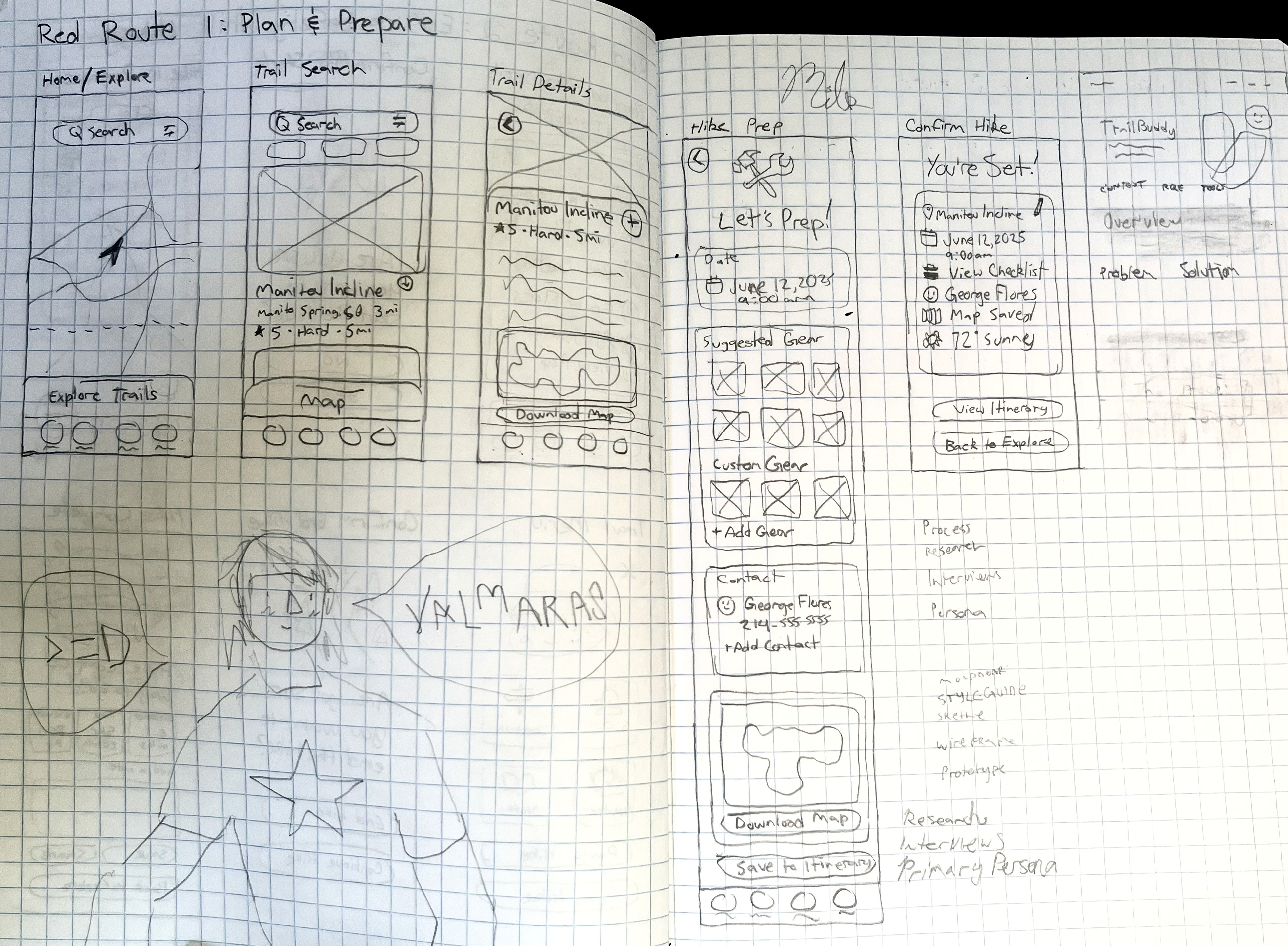
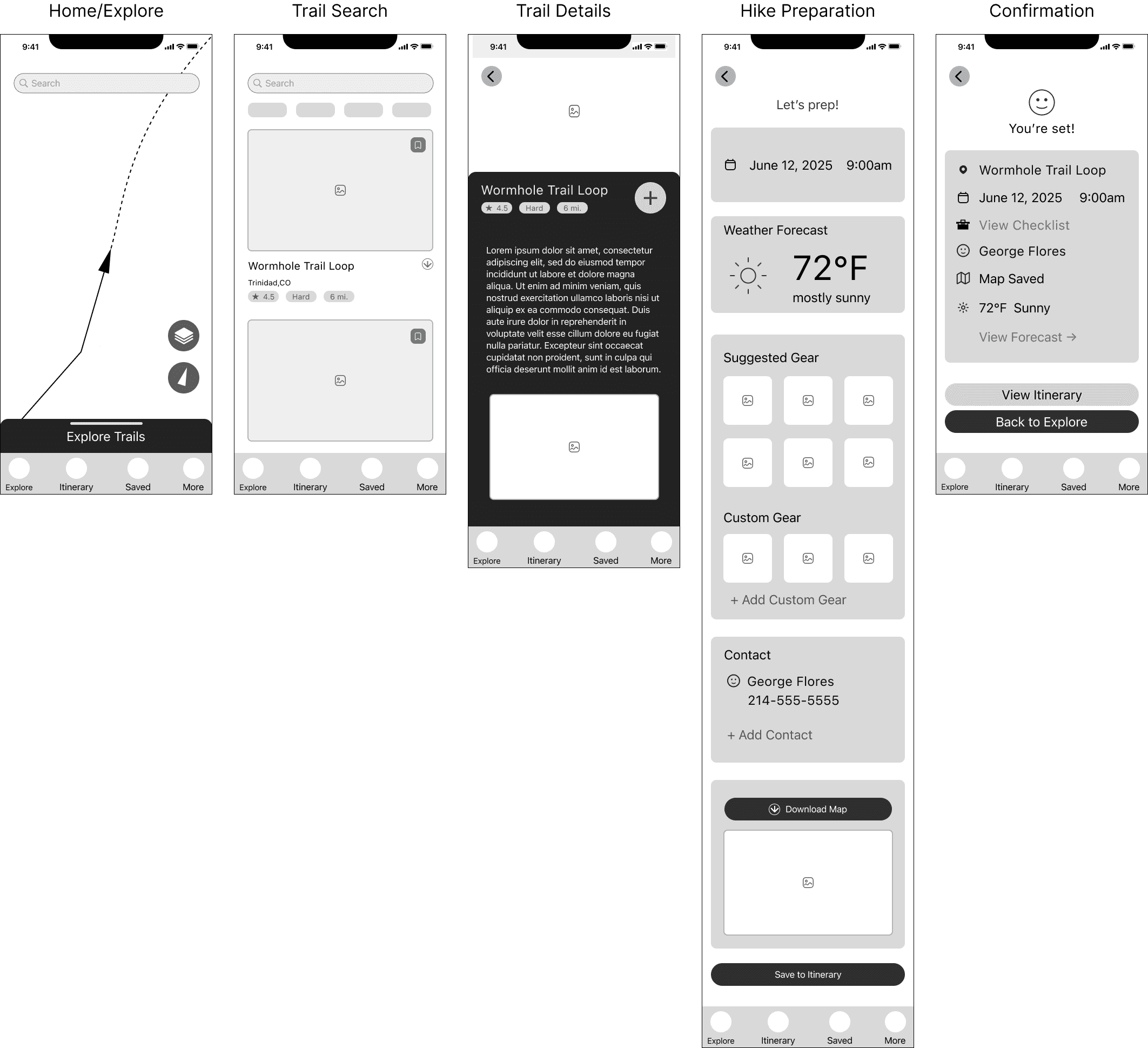
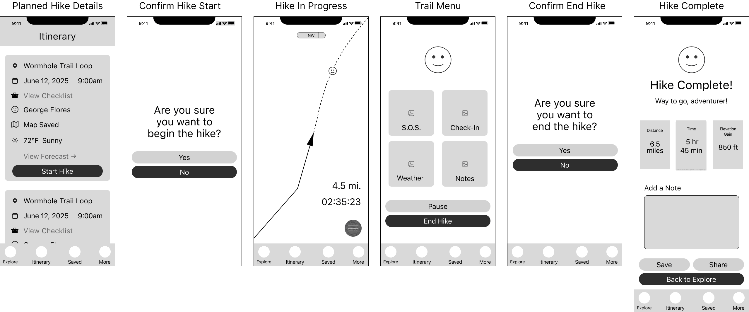
Lo-Fi Wireframes
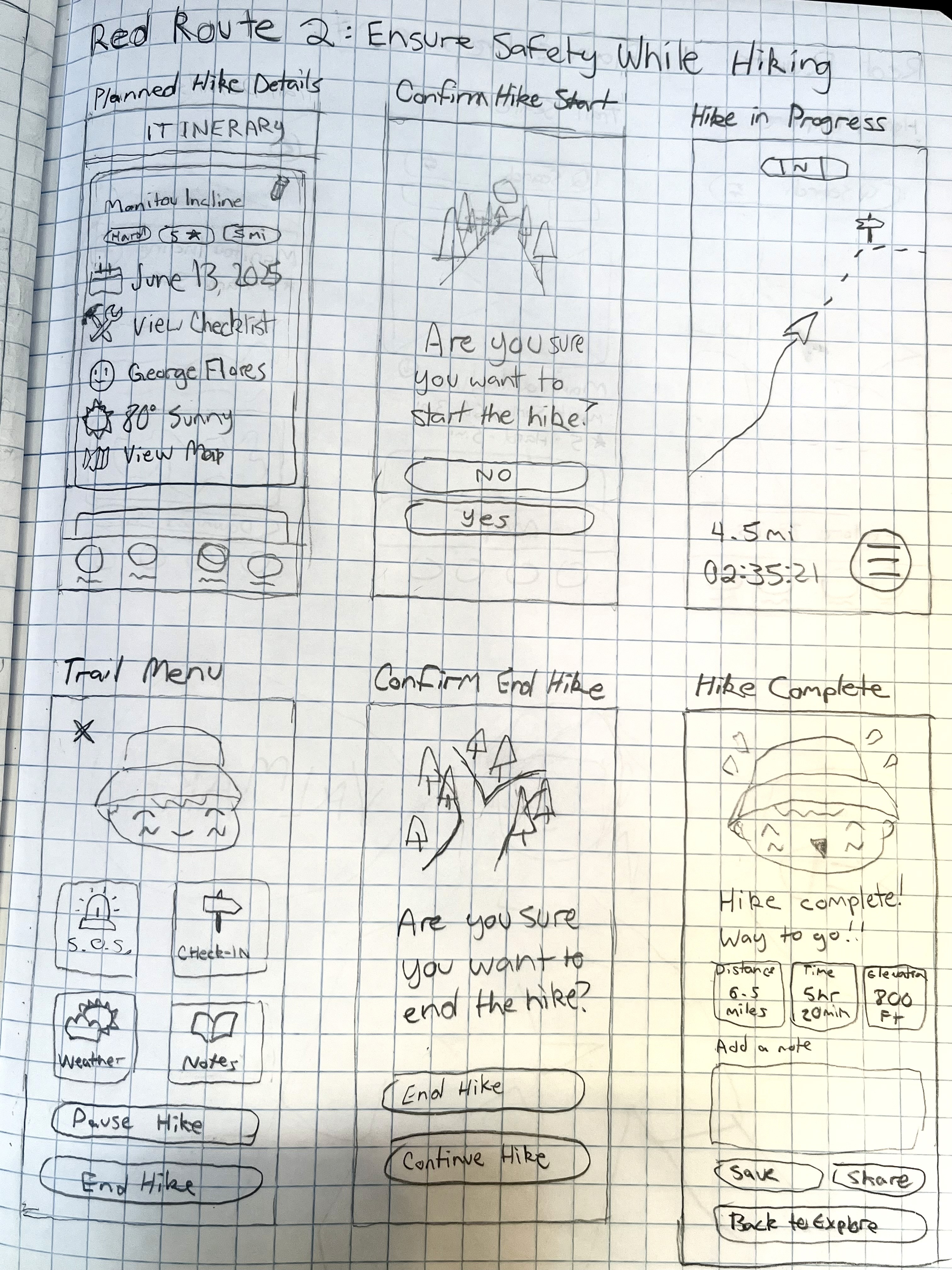
Sketches
Design
Ideation
Typography & Colors
First Prototype & Usability Testing
Second Prototype & Usability Testing
Research
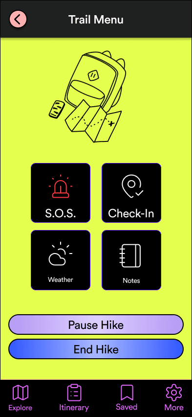
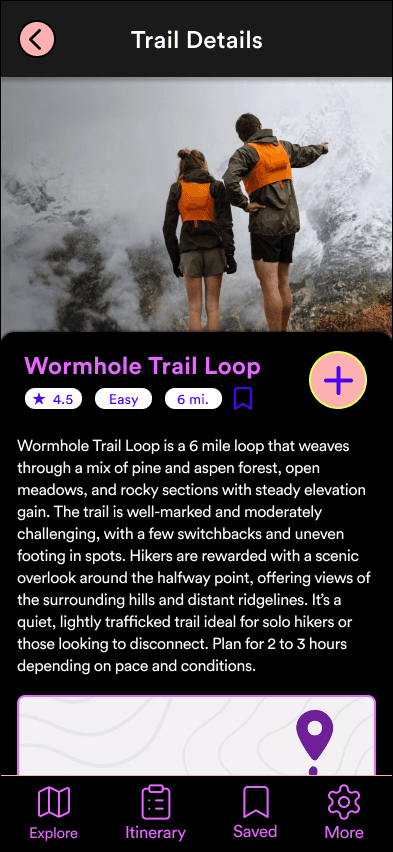
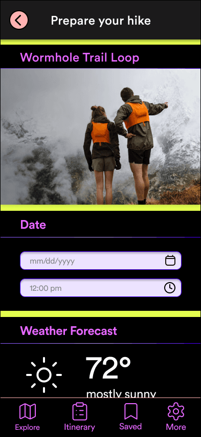
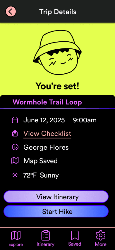
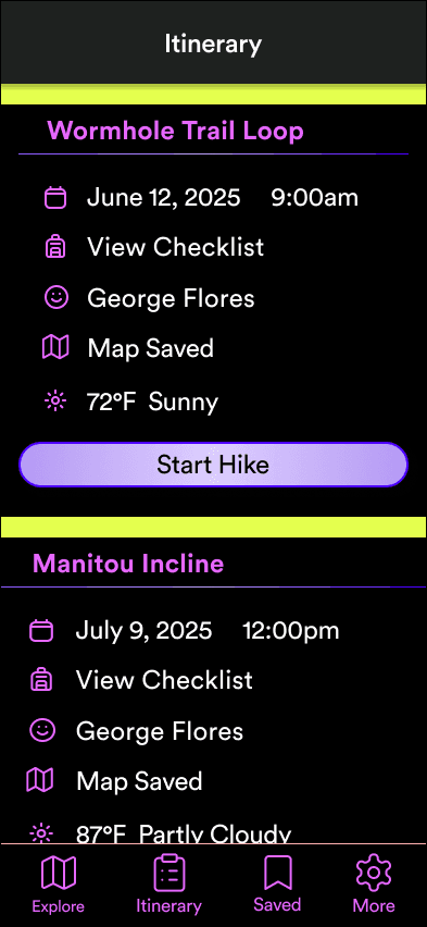
Red Route 1: Plan & Prepare for Hike
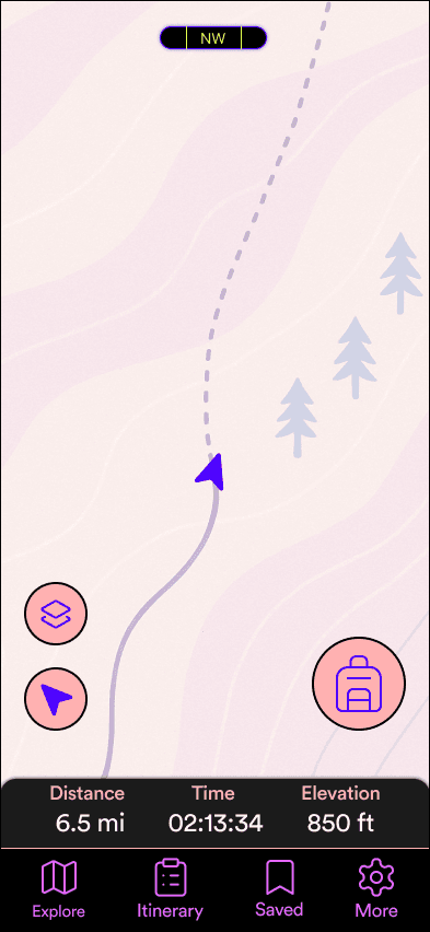
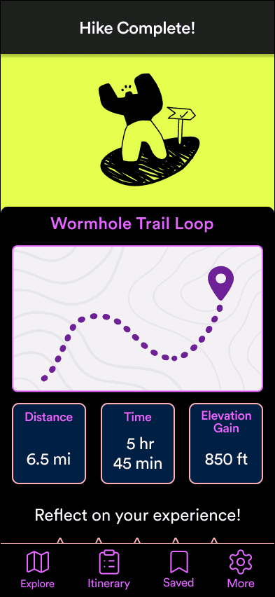
Red Route 2: Ensure Safety While Hiking
Font
Palette
Secondary Research
Primary Research
A safety-focused mobile app that helps solo hikers plan, navigate, and share their journeys with confidence.
TrailBuddy
UI/UX Case Study
I reviewed tools like AllTrails, Gaia GPS, and devices like Garmin inReach. While useful, these solutions are fragmented: planning, reviews, and safety often live in separate apps or require manual check-ins. This leaves solo hikers without a streamlined way to prepare and stay connected.
I conducted 3 user interviews with solo hikers of varying experience levels. Their stories revealed consistent needs and frustrations:
Preparedness is peace of mind – confidence came from packing properly, checking weather, and sharing plans.
Safety is the biggest concern – injuries, wildlife, or getting lost were the top fears.
Navigation feels unreliable – hikers juggle paper maps, GPS apps, and worry about signal and battery life.
Information gaps frustrate planning – vague ratings like “moderate” don’t give enough context.
Key Insights
Round 1 Findings
Round 2 Findings
Changes After Round 1
User Quotes
Motivations
Needs
Preparedness drives confidence and enjoyment on the trail.
Safety and emergency readiness are constant concerns for solo hikers.
Current tools are fragmented, forcing hikers to juggle multiple apps and manual workarounds.
Solo hikers want simple, reliable tools — not more complexity — when they’re outdoors.
“I just want someone to know where I am.”
“Even just a twisted ankle in the wrong spot could be bad.”
“People over-rely on phones—bad idea with no service.”
“I read the most dramatic reviews to see what could go wrong.”
“Hiking is basically my therapy.”
To design TrailBuddy, I combined secondary research with in-depth interviews to understand both the landscape of hiking tools and the lived experiences of solo hikers. My goal was to uncover what hikers truly need to feel prepared, confident, and safe on the trail.
Users described the UI as clean and straightforward.
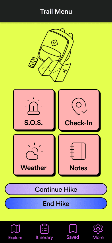
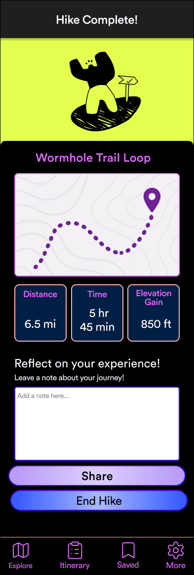
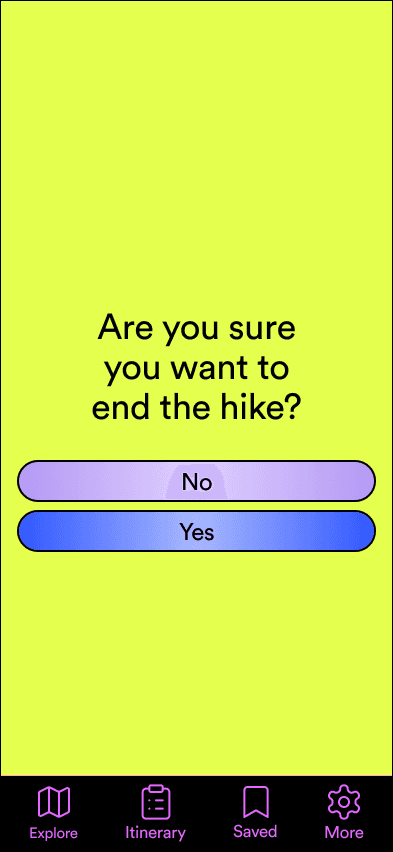
Several participants tapped the back button instead of using the End Hike CTA, revealing confusion in that flow.
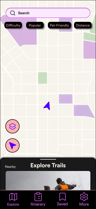
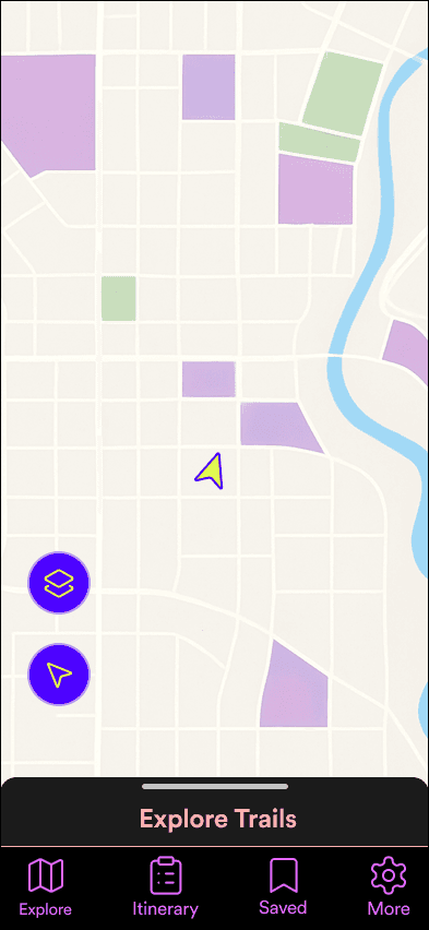
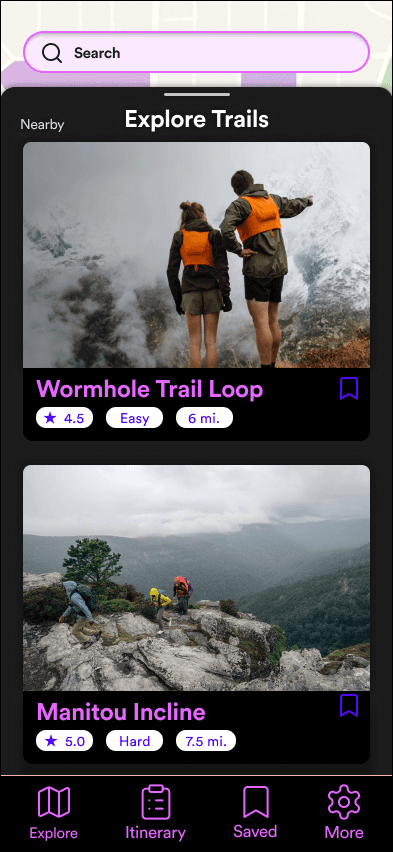
Missing search/filter options made trail discovery feel limited.
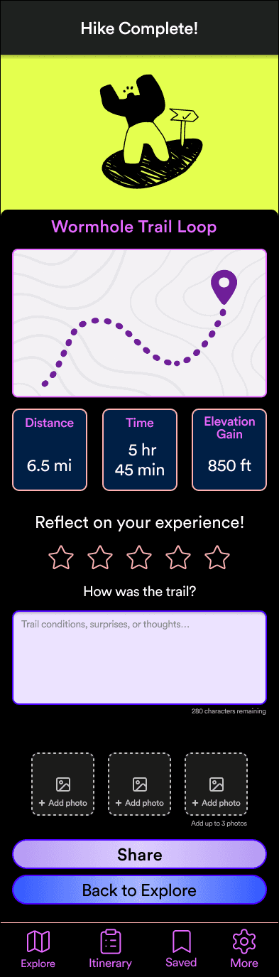
Users requested the ability to upload photos and leave star ratings in reviews.
Before
Before
Before
After
After
After
Core hike flow was clear and easy to use for all participants.
Users immediately understood the app’s purpose and described it as calm, minimal, and friendly.
Only a small hesitation appeared on the hike screen.
The updated review flow (stars, notes, photos) received positive feedback.
Some participants expected more trail options and interactive review features.
Think
Feel
Say
Do
Pains
Gains


To synthesize my research, I created an empathy map to capture how solo hikers think, feel, say, and do on the trail. This helped highlight their motivations and frustrations, and guided the creation of my primary persona.
Translating research insights into design, I created Solo Trekker Sam as a representative persona to keep user needs front and center.

Solo Trekker Sam
Independent Explorer & Nature Seeker
Age: 32
Location: Colorado
Background: Sam works a demanding job in tech and hikes solo as a way to disconnect from screens and recharge mentally. Prefers off-the-beaten-path trails but also values safety.
Experience Level: Intermediate solo hiker (5+ years of hiking, 2+ years of solo trekking)
Seeks solitude and mindfulness in nature.
Enjoys the challenge of self-reliance and navigation.
Wants a deeper connection with the outdoors.
Loves discovering hidden or less crowded trails.
Reliable trail information (difficulty, conditions, recent reports).
Emergency preparedness tools (GPS tracking, offline maps, SOS features).
Community insights (user reviews, hidden risks, seasonal considerations).
Weather & safety alerts before and during the hike.
Efficient packing checklists tailored for solo hikers.
Unreliable cell service making navigation and emergency contact difficult.
Safety concerns (wildlife encounters, injuries, getting lost).
Lack of real-time trail updates (closures, washed-out paths, weather hazards).
Gear management struggles, like packing efficiently and choosing the right equipment.
Goal
Tools
Create a streamlined, all-in-one solution that supports both planning and on-trail safety.
Figma, Miro, Canva, Google Docs, Zoom
Role
Solo UX/UI Designer — responsible for research, ideation, wireframing, prototyping, visual design, and usability testing.
ABCDEFGHIJKLMNOPQRSTUVWXYZ
I chose Circular as TrailBuddy’s primary typeface because it’s a clean, geometric sans-serif that balances legibility with approachability. It reflects the brand’s supportive and friendly tone while staying professional and modern.
ABCDEFGHIJKLMNOPQRSTUVWXYZ
1234567890
Circular
#E4FF4E
#000000
#FFB1B1
#C28CFF
#FF45C2
#4C00FF
Circular Bold
Circular Regular
Circular Medium
The TrailBuddy palette was inspired by the energy and vibrancy of outdoor adventure. Bright, bold tones were chosen to reflect the fun, approachable, and energetic spirit of solo hiking, while also ensuring visibility and clarity in outdoor conditions. Unlike muted, earthy palettes often seen in outdoor apps, these colors create a more engaging and motivating experience — encouraging users to feel confident and excited as they prepare for their hikes.
I built the first interactive prototype in Figma, focusing on the core red-route flows: planning a hike and ensuring safety while hiking. My goal was to test whether users could move through these flows intuitively and identify any friction points.
For the second round of usability testing, I refined the prototype based on feedback from Round 1 and focused on validating the updated flows.
Testing & Iteration
Research
Ideation
Design
Testing & Iteration
Reflection
With research insights in hand, I began exploring solutions through rapid sketching and low-fidelity design. My goal at this stage was to generate a wide range of ideas, prioritize features tied to user pain points, and translate them into simple flows that could be tested early.
TrailBuddy’s visual design balances clarity with personality, using typography and color to create an experience that feels both supportive and energizing for solo hikers.
Defining the Problem
Proposed Solution
Problem Statement
Solo hiking offers freedom and peace — but it also comes with risks and uncertainty.
TrailBuddy aims to provide a streamlined, safety-focused mobile app where hikers can plan their routes, share itineraries with trusted contacts, access safety tools, and track progress in one place.
Solo hikers often lack a single, reliable tool that helps them prepare, navigate, and stay safe on the trail. Current solutions are fragmented — hikers juggle multiple apps, manual check-ins with friends, and paper checklists, which can leave gaps in safety and confidence.
Key Outcomes
User Validation
Reflection
This project highlighted the importance of connecting research to design, iterating through testing, and designing with clarity to build user confidence.
Improved Preparedness – Hikers can plan routes, save itineraries, and share them with trusted contacts.
Peace of Mind – Offline GPS tracking and a clear End Hike flow reduce uncertainty on the trail.
Streamlined Experience – Instead of juggling multiple apps, users have a single, intuitive tool.
Testing confirmed that the app felt easy to navigate, calm, and confidence-boosting.
Participants especially appreciated the End Hike flow improvements and the ability to leave reviews with photos and star ratings.
This project reinforced how critical it is to connect research insights directly to design decisions. Each improvement — like clarifying button copy, reintroducing the search bar, and refining the review flow — came directly from real user feedback.
I learned the importance of iteration through usability testing. Even small refinements, such as adjusting button contrast or adding a confirmation modal, made the app feel more intuitive and trustworthy.
Designing for safety taught me that clarity is non-negotiable. Every label, button, and flow needed to reduce uncertainty and support peace of mind.
If I could take this project further, I’d test TrailBuddy in real outdoor environments to validate its usability beyond the controlled prototype. I’d also explore adding community-driven features, such as shared trail tips and photos, while maintaining the solo-hiker focus.
Ultimately, TrailBuddy showed me how thoughtful UX design can provide not just functionality — but confidence and reassurance in moments that matter.
“Sometimes the trail markers aren’t even there when you need them.”
“How will I navigate if I lose signal?”
“The last thing I want is to feel stuck without a way out.”
Frustration with insufficient trail info or poor conditions.
Stress when encountering unexpected challenges, like poorly marked trails.
Clear trail details and GPS tracking reduce uncertainty.
Offline maps and retrace features ensure hikers don’t feel stranded.
Safety tools like SOS and check-ins provide peace of mind.
Reliable trail data and reviews help hikers prepare with confidence.
Gear reminders and preparation checklists reduce anxiety and build readiness.
Outcome
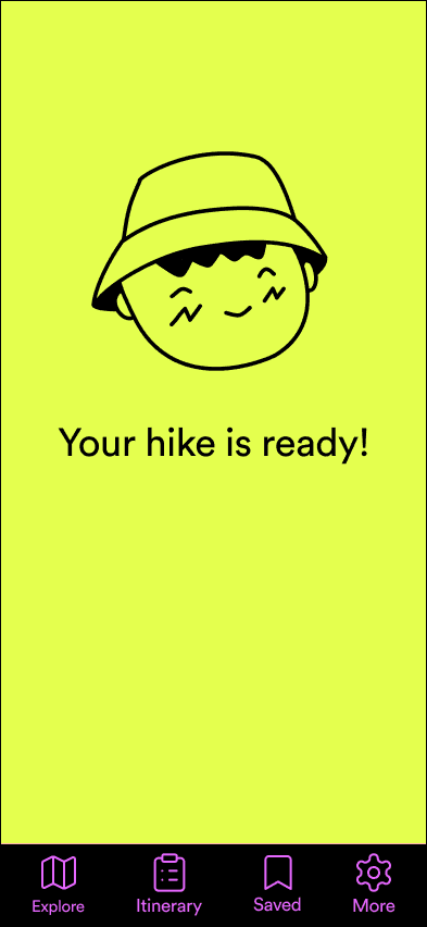
After two rounds of usability testing and iterative design, TrailBuddy delivers a streamlined, safety-first experience for solo hikers. By combining planning, safety, and reflection tools into one app, the final design solves the core challenges uncovered in research.
Introduced options for photo uploads and star ratings in reviews.
Reworked the End Hike flow with a clearer CTA.
Added a search bar with taxonomy filters for trails.
Pain Points