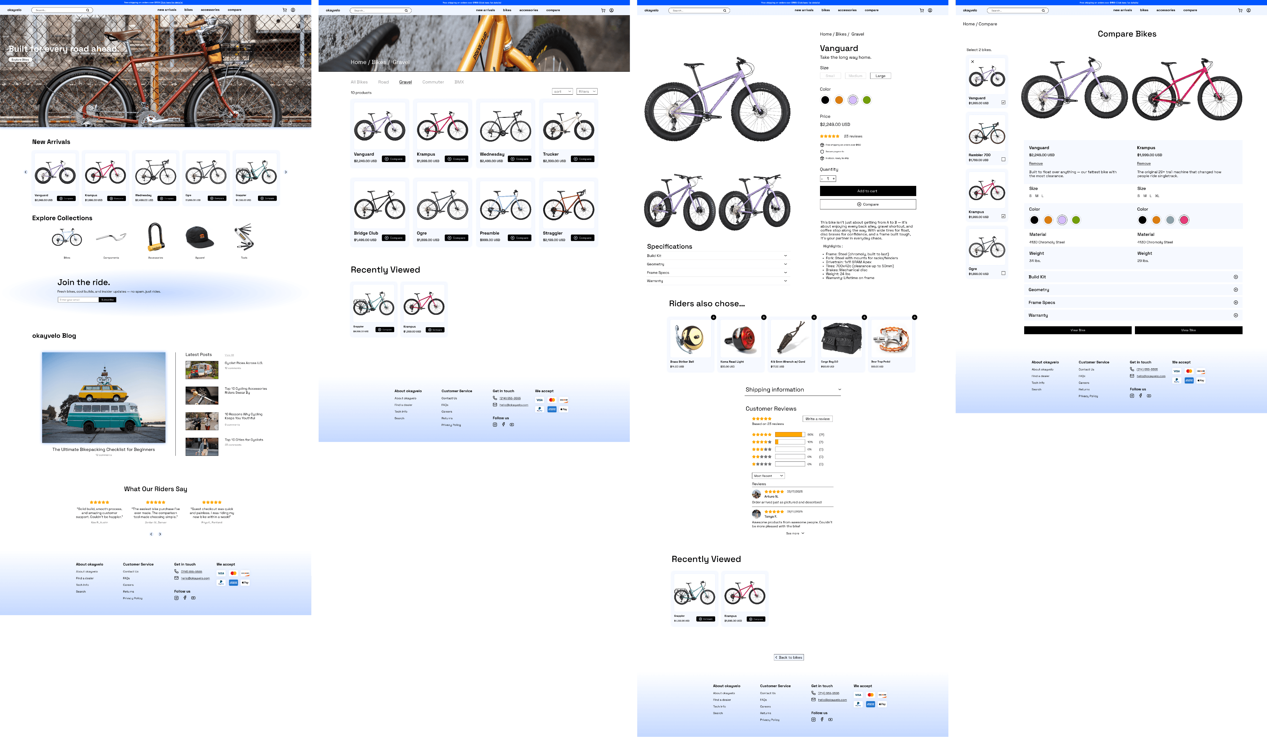
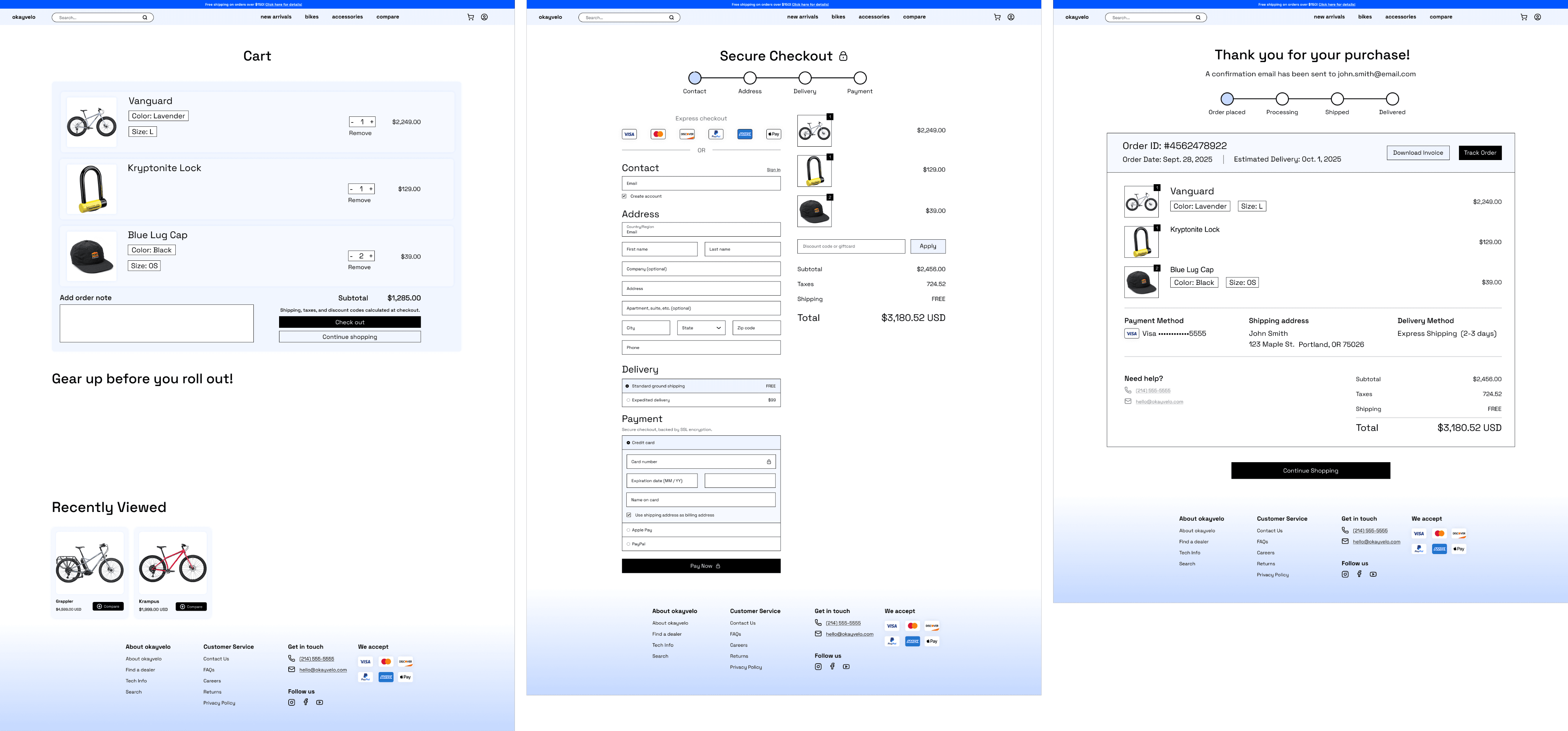
okayvelo is a desktop e-commerce experience that helps riders browse, compare, and buy bikes with confidence. I designed the flow end-to-end with a focus on adding a side-by-side compare feature and improving perceived security during checkout to reduce friction and increase conversion.
Project Overview
Process
Empathy Map
Primary Persona
Lo-Fi Wireframes
Design
Ideation
Typography & Colors
First Prototype & Usability Testing
Second Prototype & Usability Testing
Research
Font
Palette
Research Methods
Okayvelo is a mobile e-commerce experience designed for riders who want to browse, compare, and buy bikes with confidence.
okayvelo
UI/UX Case Study
Secondary Research – Reviewed e-commerce UX reports and articles (Baymard Institute, NNGroup, Chargebee, etc.) to understand common causes of cart abandonment and what best practices improve conversion.
Competitive Analysis – Documented purchase flows from Trek, Amazon, and Target, noting where they supported product comparison, how they structured checkout, and which trust signals they emphasized.
Affinity Mapping – Clustered observations into clear themes: difficulty comparing specs, friction caused by mandatory accounts, and reassurance provided by visible security cues.
Empathy Mapping & Persona – Synthesized findings into an empathy map and persona representing a high-income, research-heavy rider who takes bike buying seriously but wants the process to feel simple and trustworthy.
Key Insights
Round 1 Findings
Round 2 Findings
Changes After Round 1
Motivations
Needs
Pain Points
Users open multiple product pages but struggle to compare details.
Forcing account creation is a major barrier at checkout.
Trust signals (lock icons, payment logos, delivery info) reassure buyers making expensive
purchases.
Shoppers prefer simple, scannable product info when narrowing choices.
I started by reviewing competitor sites and industry best practices to understand why users drop off during browsing and checkout. My methods included secondary research, competitor walkthroughs, and synthesis exercises.
Before
Before
After
After
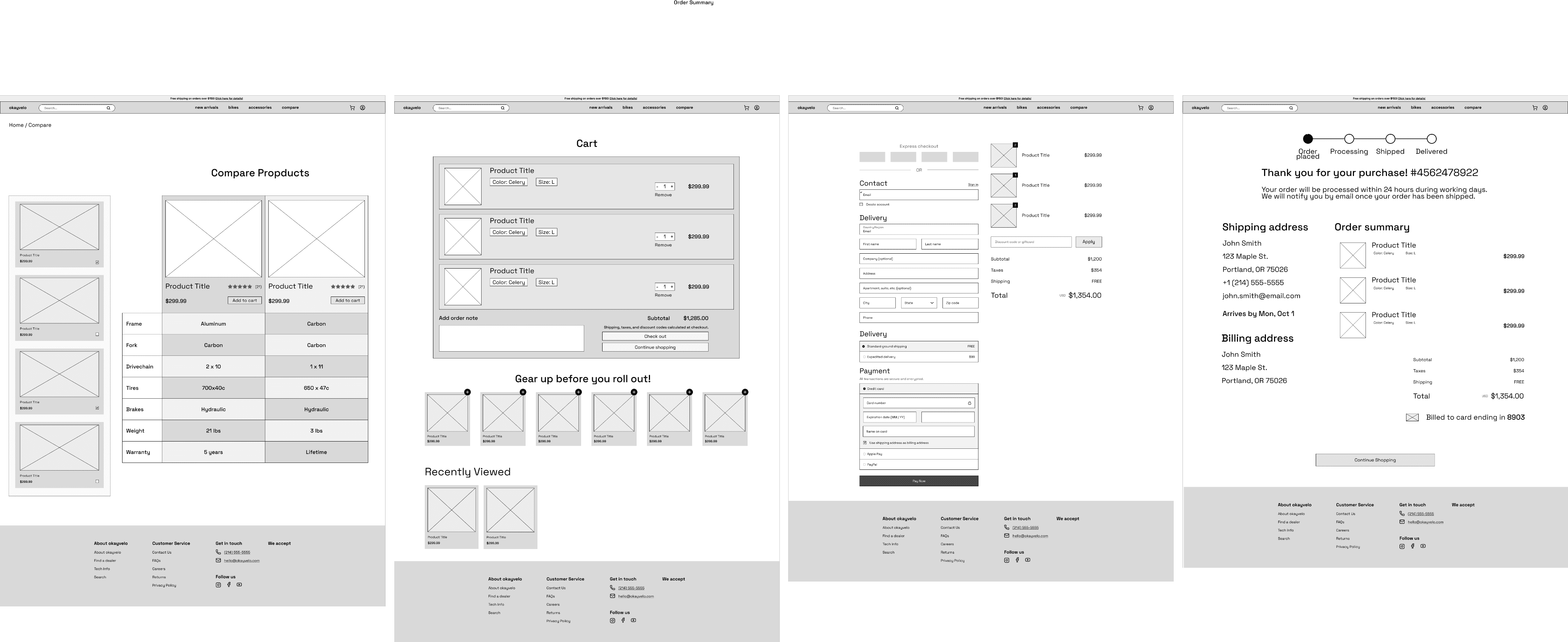
The new two-bike compare feature worked smoothly and eliminated previous confusion.
Participants liked the simplicity of the table but still skimmed through some specs too quickly.
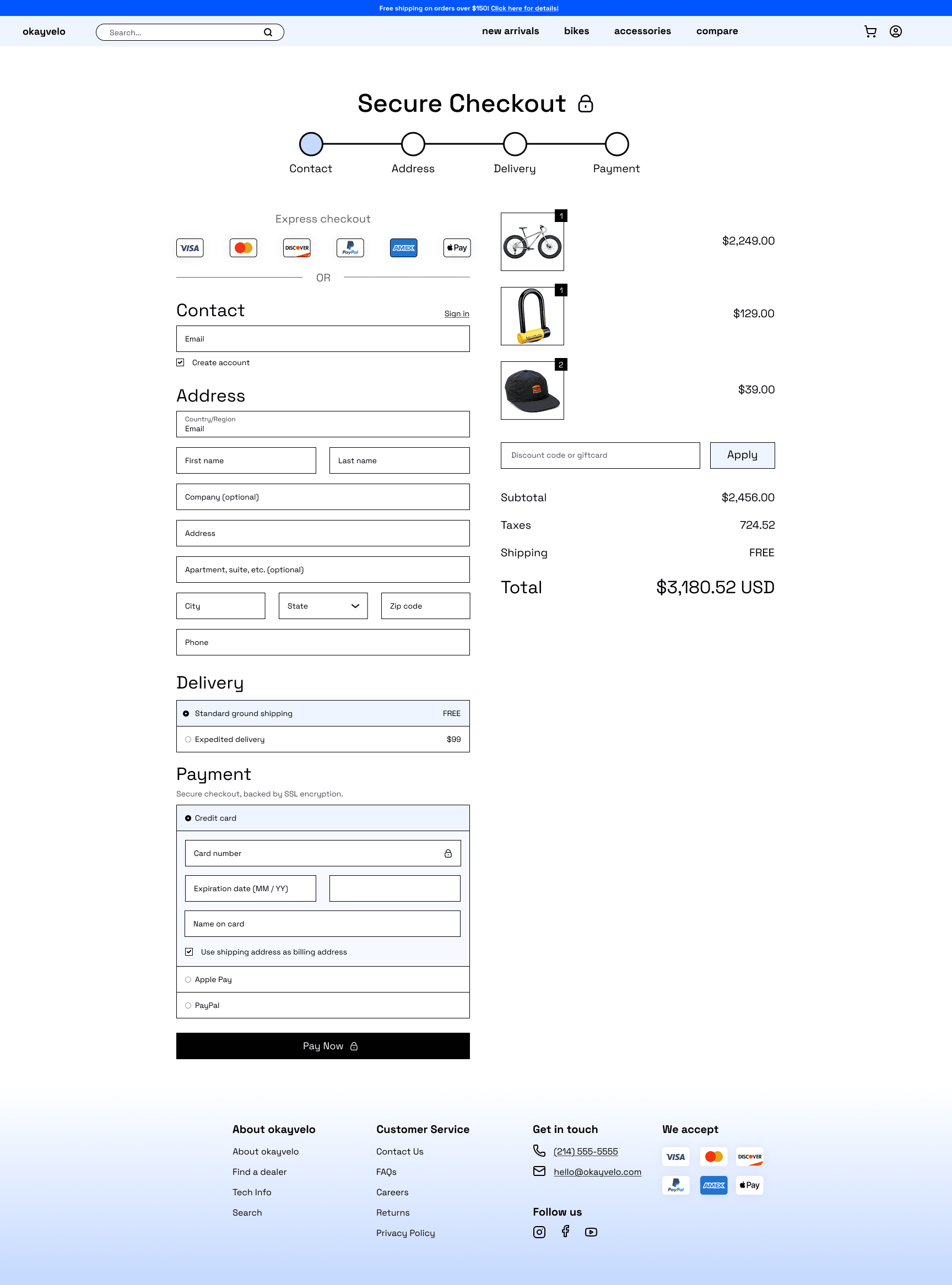
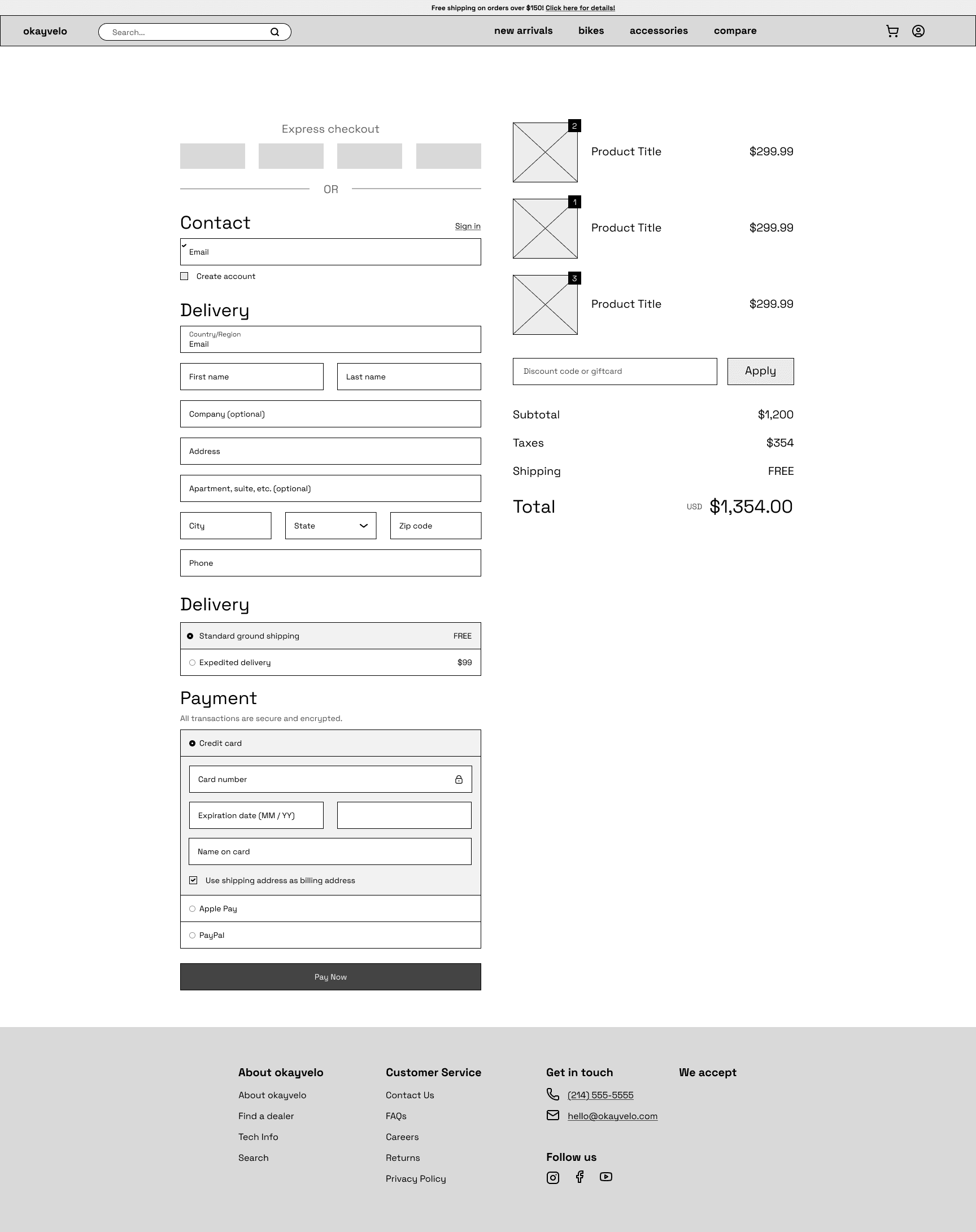
All users completed guest checkout without help; trust cues were noticed earlier and felt reassuring.
Upsells were visible but still drew limited interaction.
One participant wanted more detail about delivery timing on the confirmation page.
Think
Feel
Say
Do
Pains
Gains
I created an empathy map to capture what riders think, feel, say, and do when shopping for a bike online. This helped me center the design around user frustrations—like difficulty comparing specs—and their goals, such as wanting a smooth, trustworthy checkout.
From my research and empathy mapping, I developed a primary persona: a serious rider who invests time and money in the right bike. This persona guided design decisions by keeping the focus on clarity, confidence, and reducing friction in the shopping flow.
Serious Cyclist Alex
High-Income Enthusiast & Performance Seeker
Age: 29
Location: Portland, Oregon
Background: Alex is passionate about cycling as both a hobby and a lifestyle. He frequently researches high-end bikes online, reading specs and reviews before making purchase decisions.
Experience Level: Intermediate-to-advanced cyclist (rides 4–5x per week, invests in premium gear)
Wants confidence in choosing the right high-ticket product.
Enjoys exploring gear innovations and staying current with bike tech.
Values efficiency and clarity when shopping online.
Looks for trust signals to justify large investments.
Clear product comparison tools to evaluate specs side-by-side.
Fast, frictionless checkout with a guest option.
Mobile-friendly flows with large CTAs and autofill for forms.
Trust signals (warranties, reviews, security badges) at every stage.
Overwhelmed by too many options without clear guidance.
Forced account creation leading to cart abandonment.
Confusing product navigation (e.g., subcategories, cluttered listings).
Distrust when policies, warranties, or reviews are unclear.
Frustration with broken or inconsistent mobile checkout flows.
Goal
Tools
Design an e-commerce flow that enables confident bike comparison, improves checkout completion, and increases trust at the point of purchase.
Figma, Miro, Canva, Google Docs, Zoom
Role
Sole UX/UI Designer — responsible for research, ideation, wireframing, prototyping, visual design, and usability testing.
ABCDEFGHIJKLMNOPQRSTUVWXYZ
I chose Space Grotesk for its clean geometry and high readability. It gives the interface a modern, utilitarian tone that fits Okayvelo’s identity—technical yet approachable.
ABCDEFGHIJKLMNOPQRSTUVWXYZ
1234567890
Space Grotesque
#FFFFFF
#000000
#0055FF
#F6F9FF
Space Grotesque Bold
Space Grotesque Regular
Space Grotesque Medium
The palette is monochromatic, built from black, white, and variations of blue (#0055FF). Gradients of the same hue add subtle dimension while keeping the look focused and cohesive.
I conducted two rounds of usability testing to validate the browsing, compare, and checkout flows. Feedback from the first round guided targeted refinements that improved clarity, reduced friction, and strengthened user confidence throughout the experience.
After incorporating the first round of feedback, I refined the prototype to simplify the compare flow, reinforce existing trust cues, and polish the overall browsing and checkout experience. The updated design was tested again with five participants to validate improvements and identify any remaining issues.
Testing & Iteration
Research
Ideation
Design
Testing & Iteration
Reflection
Guided by research insights and my primary persona, I explored ways to make bike shopping simpler and more intuitive. Early sketches focused on clear navigation, a two-bike comparison mechanic, and a checkout flow that reduced friction.
The design focused on creating a clear, trustworthy shopping experience that balanced function and personality. Visual consistency and hierarchy guided users through the browsing and checkout flow without distraction.
Defining the Problem
Proposed Solution
Problem Statement
Riders struggle to compare bikes online and often abandon checkout due to friction and lack of trust.
okayvelo introduces a side-by-side bike comparison and a guest checkout with visible security cues, helping riders make confident decisions and reducing cart abandonment
Shoppers lack a clear, streamlined way to compare bikes and a trustworthy, low-friction checkout process. Existing e-commerce flows overwhelm users with multiple product pages and force account creation at checkout, leading to hesitation and abandonment.
Key Outcomes
User Validation
Reflection
This project taught me how small UX decisions can have a big impact on user trust and clarity.
Simplified bike comparison with a two-bike limit and clearer layout.
Stronger sense of trust and security during checkout.
Reduced friction through guest checkout and better visual hierarchy.
Improved overall flow consistency from browsing to confirmation.
Participants in the second round of testing confirmed that the new design felt smoother, more intuitive, and trustworthy. The compare feature worked as expected, and visible security cues made checkout feel safe. Users said they’d feel confident completing a purchase on Okayvelo.
Throughout Okayvelo, I learned the value of refining—not reinventing—core e-commerce patterns. Simplifying the compare mechanic and emphasizing existing trust cues showed me how perception can matter as much as functionality. I also gained experience balancing business goals like conversion with user needs for confidence and simplicity. If I had more time, I’d explore responsive versions and deeper personalization, but the outcome demonstrates how thoughtful adjustments can make complex shopping experiences feel effortless.
Clear trail details and GPS tracking reduce uncertainty.
Offline maps and retrace features ensure hikers don’t feel stranded.
Safety tools like SOS and check-ins provide peace of mind.
Reliable trail data and reviews help hikers prepare with confidence.
Gear reminders and preparation checklists reduce anxiety and build readiness.
Outcome
The final Okayvelo prototype delivers a cleaner, more intuitive shopping experience that supports users from browsing to purchase. Limiting the compare feature to two bikes clarified decision-making, while visible trust cues and a guest checkout flow reduced friction and boosted confidence. The result is a design that feels simple, reliable, and built for riders who take their choices seriously.


“Sometimes the trail markers aren’t even there when you need them.”
“How will I navigate if I lose signal?”
“The last thing I want is to feel stuck without a way out.”
Frustration with insufficient trail info or poor conditions.
Stress when encountering unexpected challenges, like poorly marked trails.
User Flow
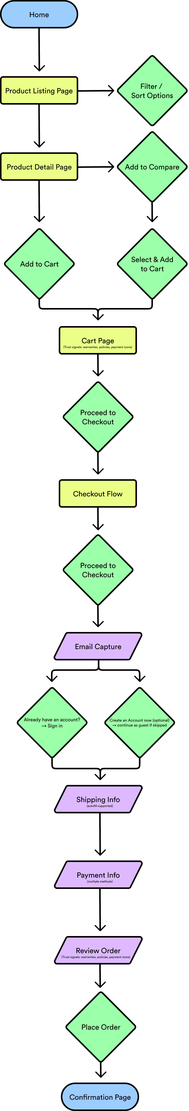
Home
Product Compare Page
Product Listing Page
Cart
Product Detail Page
Checkout
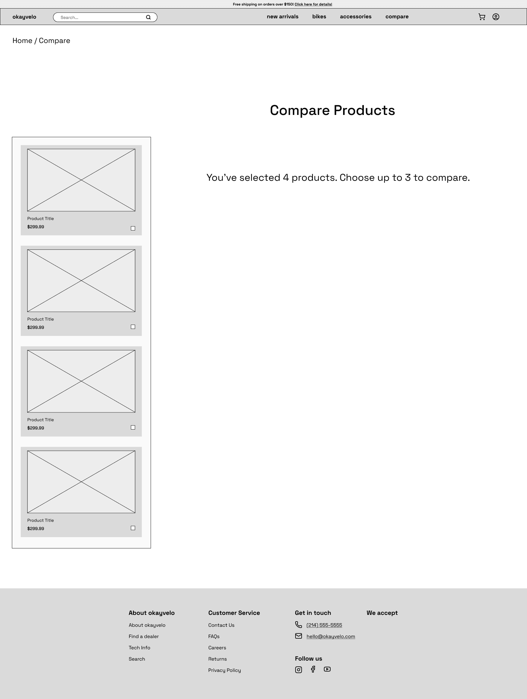
Product Compare Page (empty)
Confirmation Page
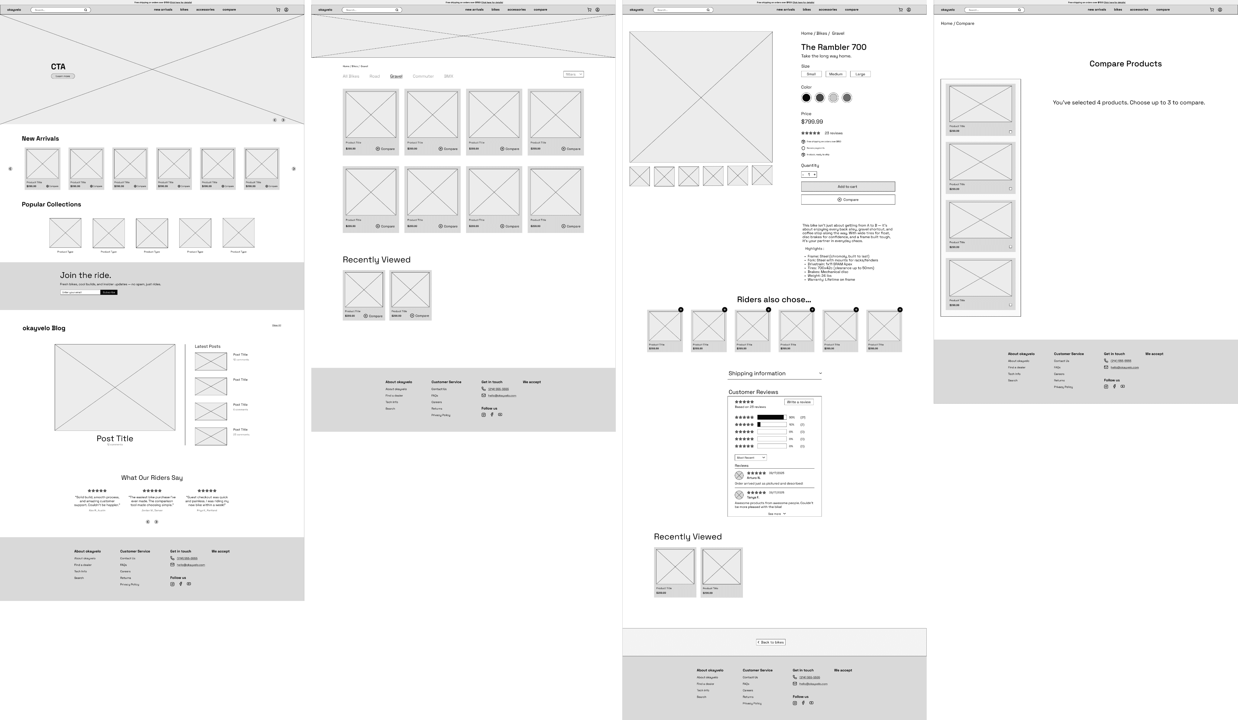
Some users were confused after adding bikes to compare and expected them to appear automatically.
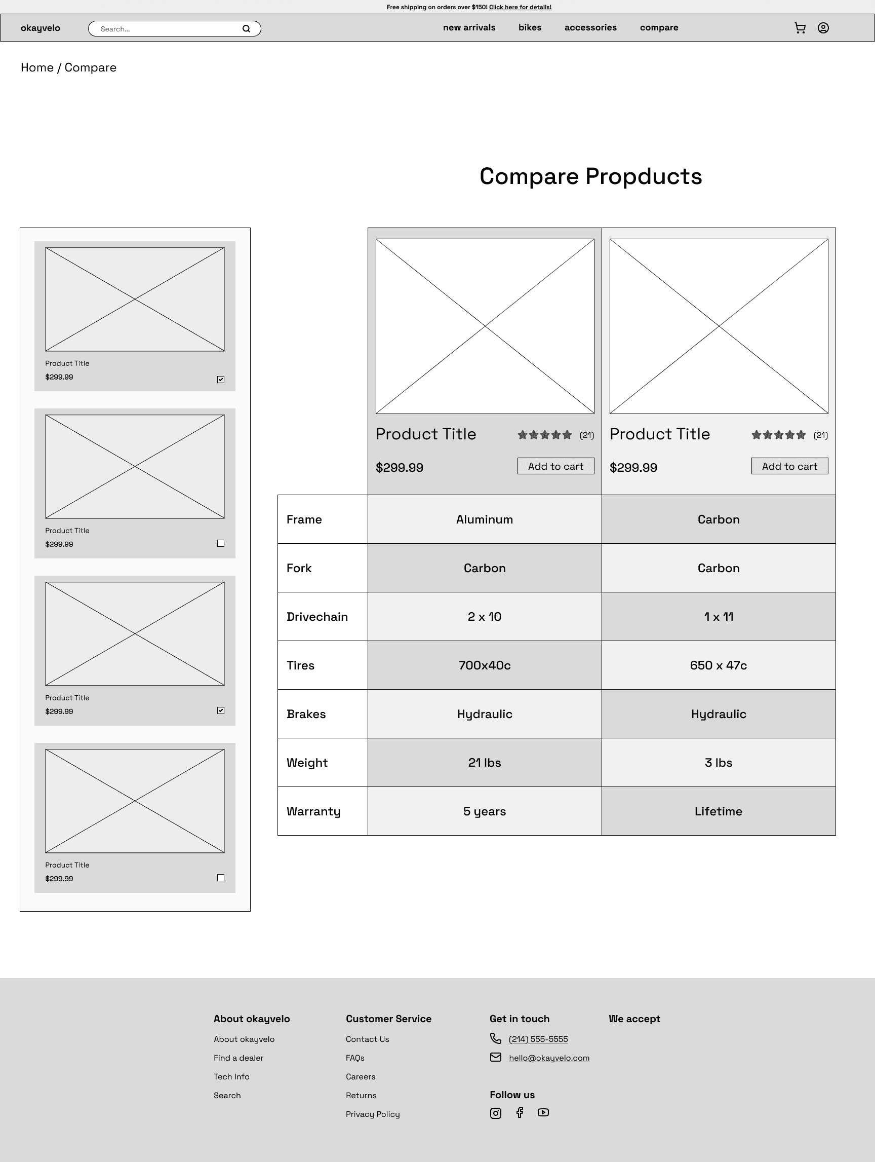
The spec table in Compare felt dense and hard to scan.
A few participants overlooked existing trust cues and wanted clearer reassurance earlier in checkout.
Minor requests for more detailed delivery information after purchase.
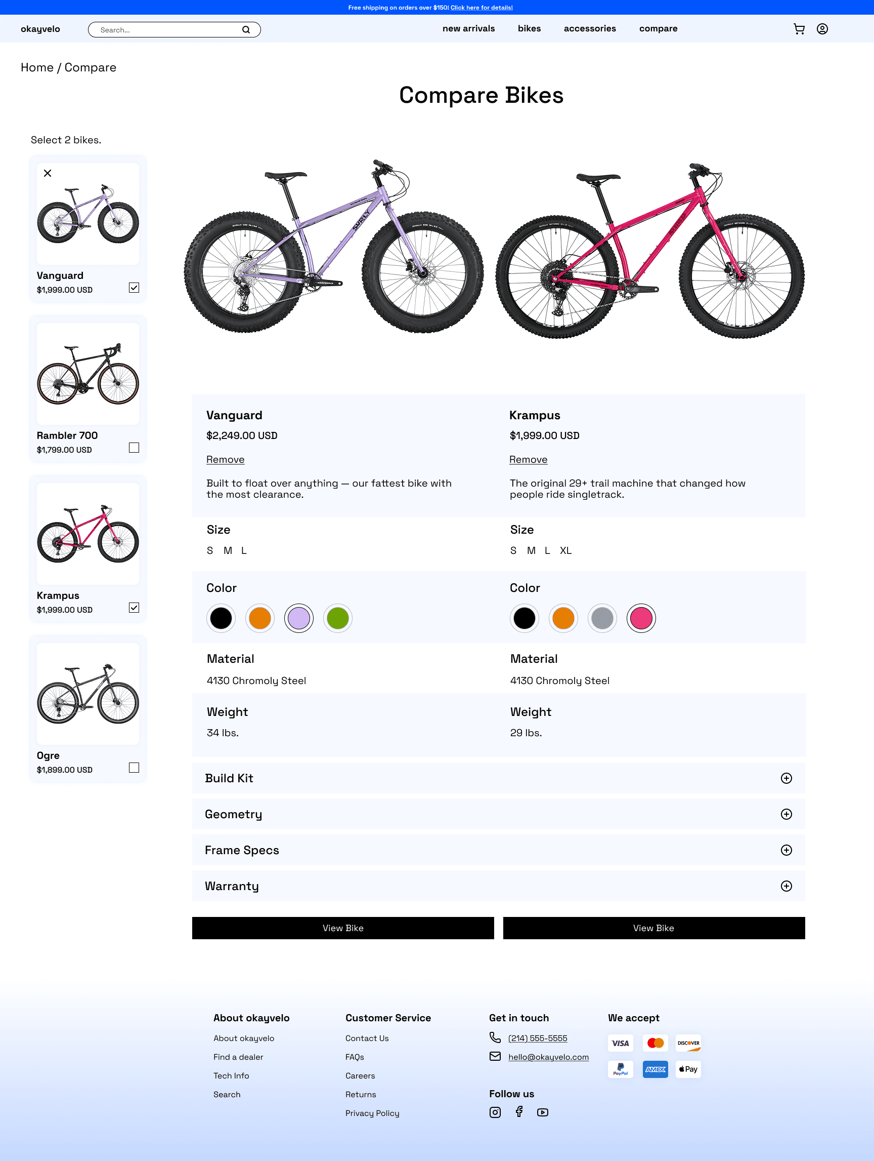
Simplified the compare mechanic so bikes appear automatically without re-selection.
Strengthened trust cues and reinforced them earlier in the checkout flow.
Adjusted table formatting for easier scanning and added subtle visual grouping & limited the comparison to two bikes for clarity.