This project was completed over a 5-day design sprint, following a structured process from problem definition to tested prototype.
Project Overview
Process
Testing
Sketch
Decide & Storyboard
Prototype
Understand
An augmented reality mobile app that lets museum visitors scan artworks to instantly access short, insightful context about what they're viewing.
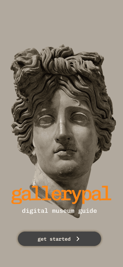
gallerypal
In order to design a solution that felt truly useful inside the museum, I began by clarifying the problem, identifying user pain points, and mapping out the visitor's in-gallery experience.
Goal
Tools
Design a mobile experience that helps museum visitors quickly understand and connect with artworks during their visit.
Figma, Photoshop, Google Forms, Pen & Paper
Role
Solo UX/UI Designer — responsible for research, user flows, wireframes, visual design, and prototyping.
Understand
Sketch
Decide
Prototype
Validate
On Day 2, I focused on ideating possible solutions by referencing existing products and generating screen variations.
With promising ideas in hand, I narrowed in on a solution and mapped out the full user experience.
With a clear storyboard in place, I built a functional prototype ready for testing.
I conducted user testing to evaluate whether GalleryPal delivered value in the context of a real museum visit.
Defining the Problem
Proposed Solution
Problem Statement
Visitors often lack quick, accessible context to fully appreciate the art they’re viewing.
GalleryPal offers a self-guided, immersive way to engage with art by allowing users to scan works in the gallery and instantly receive brief, digestible insights tailored to what they want to know—like artist intent, technique, or fun facts.
Museum visitors often feel like they’re missing out on the meaning behind artworks because traditional labels and tours can be either overwhelming, inaccessible, or too limited.
Reflection
A look back at what I learned, what worked, and what I’d improve with more time.
Designing GalleryPal pushed me to balance immersion, simplicity, and context — all within a space where users are often overstimulated or distracted. The biggest challenge was creating an experience that felt helpful without being heavy-handed, especially inside a physical environment like a gallery.
Through testing, I saw how much users appreciated having bite-sized insight delivered in real time, and how important it was to give them control over what kind of information they engaged with. If I had more time, I’d explore adding a “Browse Artworks” mode for more flexibility, and test more edge cases like dim lighting, crowded exhibits, or users who prefer not to use audio.
This sprint reinforced how much value a focused process can deliver in just five days — and how critical it is to design for context, not just screens.
Many visitors enjoy art but struggle to engage with it meaningfully in the moment. Long wall labels can feel overwhelming, and Googling artwork often leads to dense, irrelevant results. Through interviews and quotes, I found users craved quick, clear insights that would help them connect with the piece—without disrupting the flow of their visit.
This inspired a mobile experience that acts like a personal guide: simple, in-the-moment context delivered right as they view the artwork. I mapped out the key moments in this journey to better understand when and how users would interact with GalleryPal inside the museum.
I reviewed two apps:
izi.TRAVEL — I was inspired by how it combines maps, itineraries, and exhibit details, and how easily users can find and plan museum visits.
Museum Buddy — I noted how it visually organizes artwork details and includes map locations, audio tours, and a "favorites" feature.
Both apps showed the importance of minimizing text overload and offering intuitive ways to explore or learn about art.
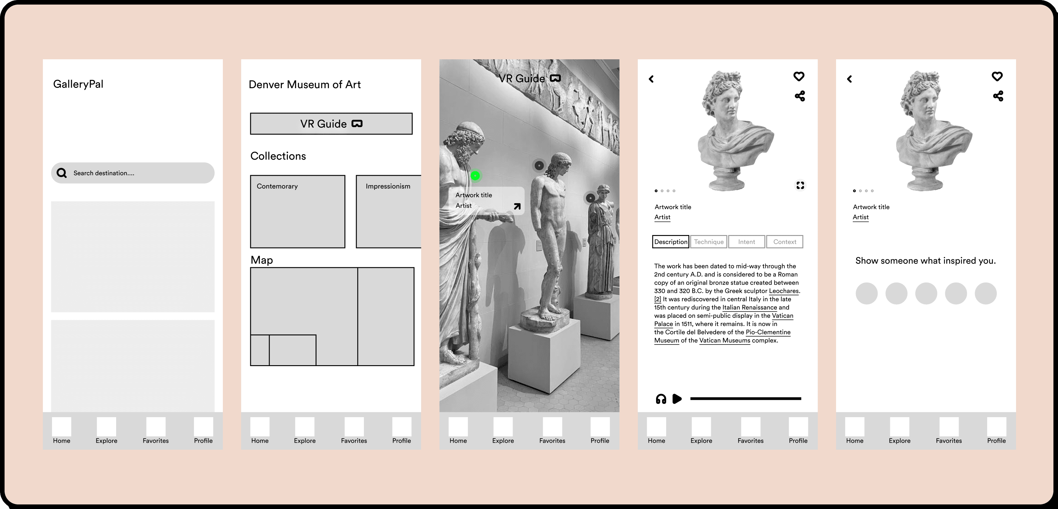
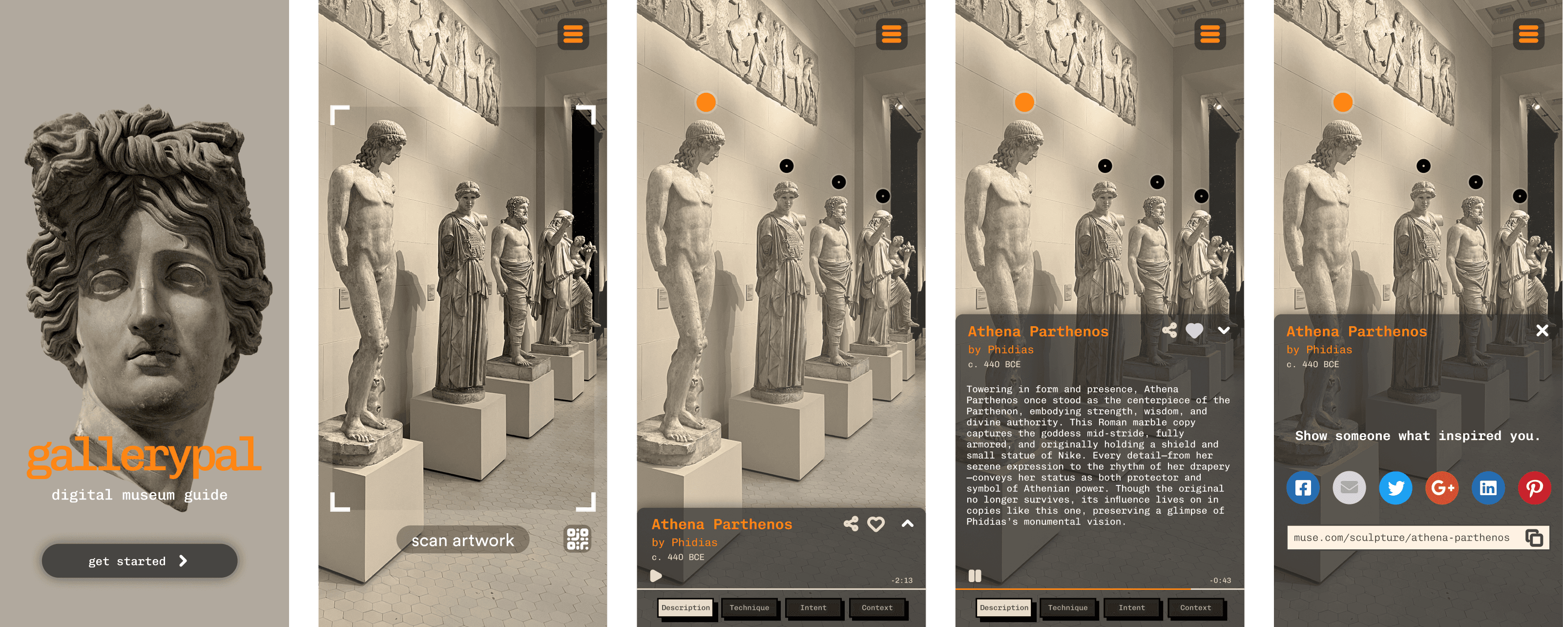
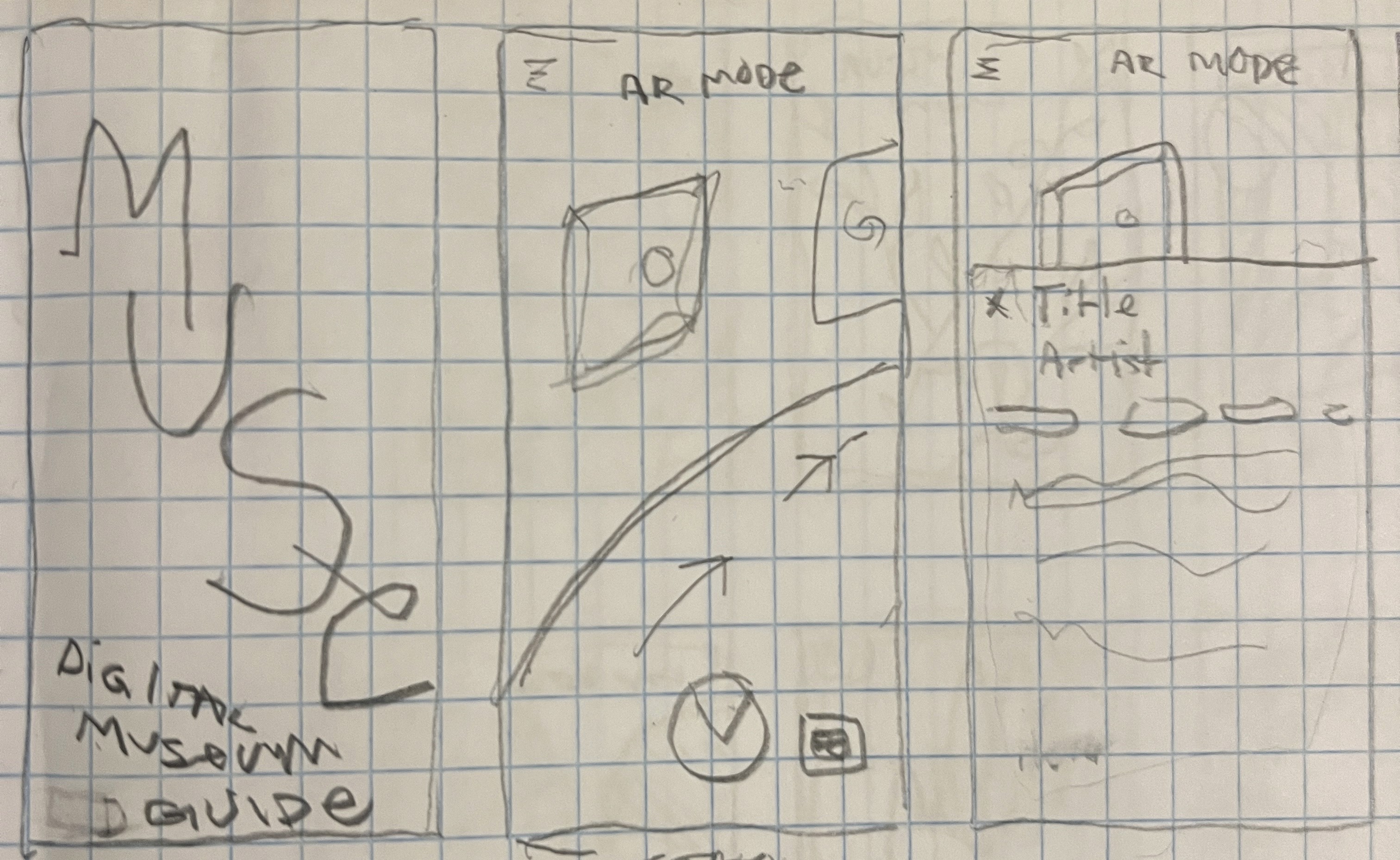
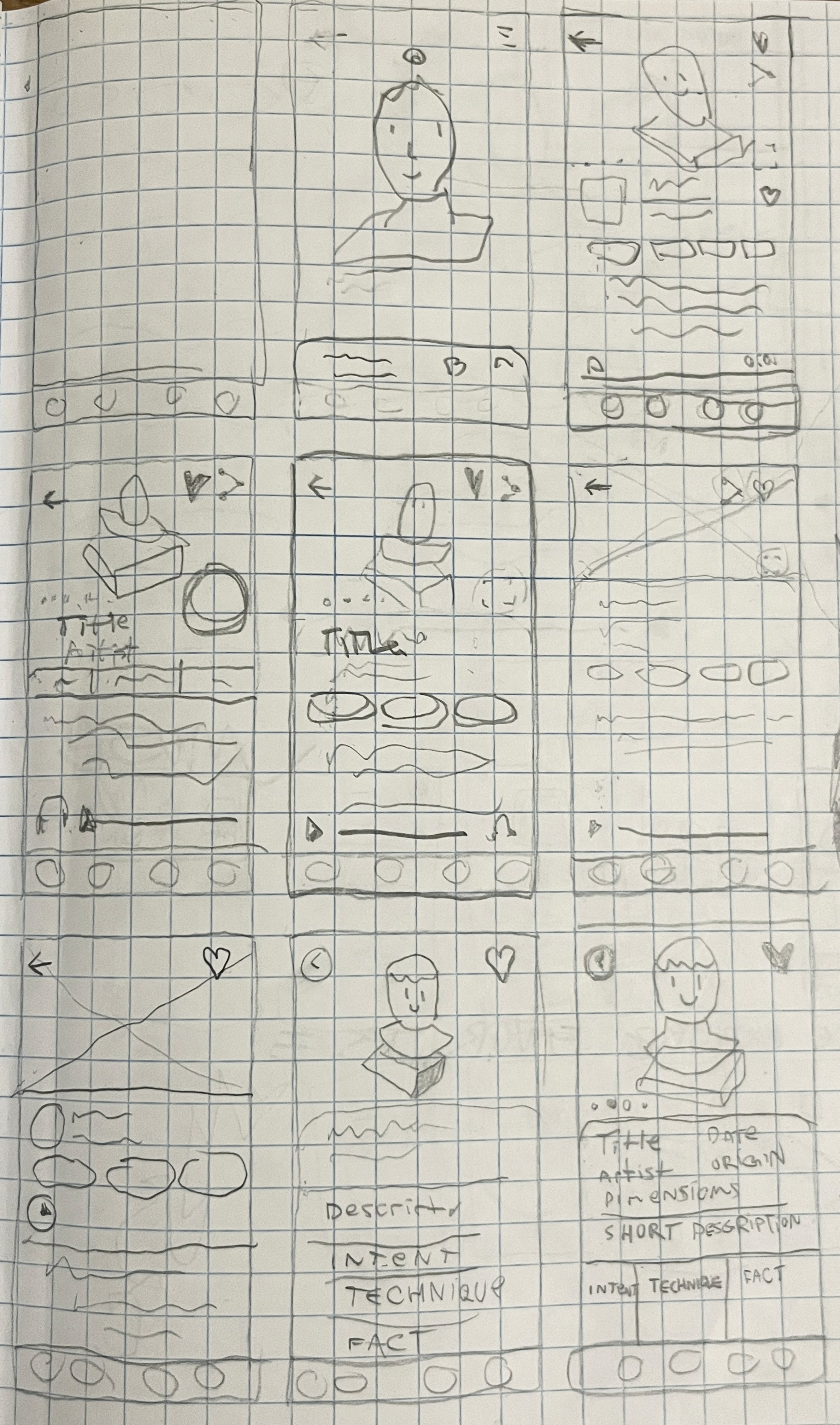
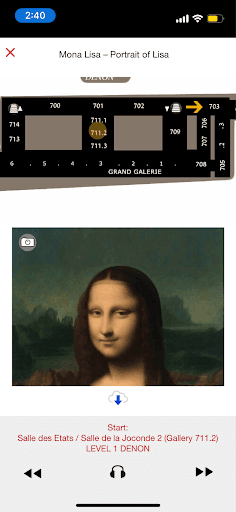
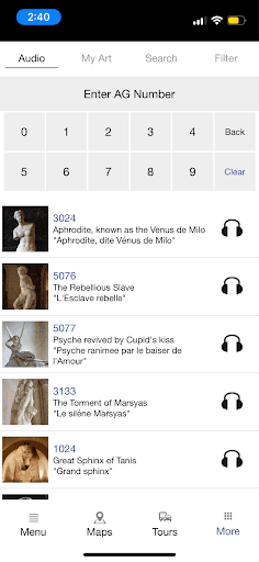
I identified the most critical screen in the user journey as the artwork recognition screen—where users receive info about a piece in real-time. This is where the product delivers the most value. Using the Crazy 8s method, I sketched eight variations of that screen to explore how information might be layered, what format it might take (overlay vs. modal), and how users might interact (tap to expand, swipe, or voice/audio).
After refining my favorite concept, I created a three-panel storyboard that includes:
Before – Entering AR Mode with the camera open.
Critical Screen – Artwork is recognized, and an info overlay appears (with tabs for Description, Technique, Intent, etc.).
After – User interacts by liking or sharing the artwork.
After reviewing my Crazy 8s sketches and identifying the AR overlay screen as the critical moment, I selected the strongest concept: an AR-powered guide that detects artworks and displays interpretive content on top. I storyboarded the complete experience to test how users would explore the museum, scan artworks, and engage with content like technique, intent, and description.
The storyboard spans the user's journey from landing on the museum homepage, entering the VR/AR mode, viewing artwork overlays, and accessing detailed info and sharing options — laying the foundation for my prototype design
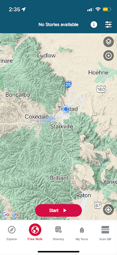
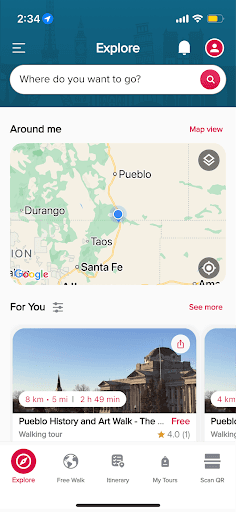
Using my storyboard as a reference, I created an interactive prototype in Figma that simulates how a visitor would use the GalleryPal app inside a museum. The prototype includes core functionality: entering AR mode, detecting artworks, displaying live overlay info, and engaging with short, digestible insights (technique, intent, description).
I kept the visuals minimal but intentional — balancing a modern aesthetic with legibility in a museum setting. The goal was to bring the AR-driven experience to life and gather actionable feedback during testing.
I tested the GalleryPal prototype with three users who matched the target audience: independent museum visitors looking for more context during their visit. Each participant was guided through the prototype in a think-aloud format, simulating a gallery experience. They explored the AR scan feature, insight tabs, and key interactions like audio playback and saving favorites. Overall, the flow was intuitive, and users responded positively to the overlay experience and the concise, well-organized content.
All testers appreciated the AR scan-to-info experience, describing it as “immersive” and “useful in the moment.”
The tabbed insight structure worked well, and users felt the tone of the content was approachable and informative.
Two testers wanted the ability to browse artworks without being in front of them, either to revisit something they saw earlier or preview the collection in advance.
Users found the interface clean and said it “fit the gallery setting.”

Crazy 8’s Exercise
Lightning Demos
Solution Sketch
Testing Experience
Summary of Findings
UI/UX Case Study